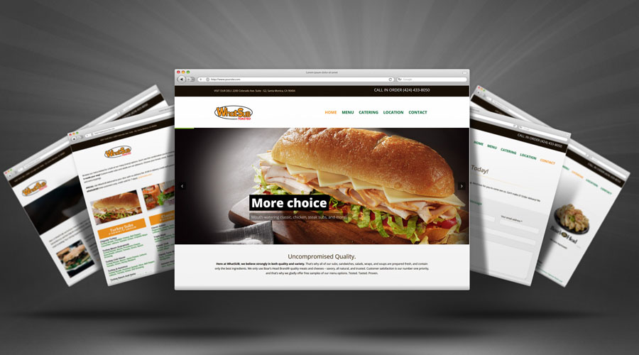
Companies may choose to remove the navigation menu on landing pages for several reasons:
- Focus on Conversion: Removing distractions such as navigation menus can help focus visitors’ attention on a specific call-to-action or conversion goal. This is common in landing pages designed for a specific campaign or product promotion.
- Simplified Design: Landing pages often have a simplified design to make them visually appealing and easy to navigate. Removing the navigation menu contributes to a cleaner and more focused layout.
- Message Alignment: Sometimes, a landing page is designed to deliver a specific message or promote a particular offer. Removing the navigation menu ensures that visitors stay on the page and follow the intended path without exploring other sections of the website.
- A/B Testing: Companies might conduct A/B testing to compare the effectiveness of landing pages with and without navigation menus. This allows them to determine which version performs better in terms of conversions and user engagement.
- Promoting Limited Offers: Landing pages for limited-time offers or exclusive deals may exclude the navigation menu to create a sense of urgency and encourage immediate action.
It’s important to note that the decision to remove the navigation menu depends on the specific goals of the landing page and the overall marketing strategy of the company. Some landing pages retain the navigation menu for users who may want to explore other parts of the website, while others prioritize a distraction-free environment to optimize conversions.
Is it better to leave off the navigation menu on a landing page? Is conversion more successful?
Whether to leave off the navigation menu on a landing page depends on the specific goals of the page and the desired user experience. Here are considerations for both options:
Pros of Removing Navigation Menu:
- Increased Focus: Without distractions, visitors may be more focused on the primary message and call-to-action of the landing page, potentially leading to higher conversion rates.
- Simplified User Journey: A clear and straightforward path can guide visitors toward the intended goal without the option to navigate away, streamlining the user journey.
- A/B Testing Opportunities: Testing landing pages with and without navigation menus can help determine which version performs better in terms of conversions and user engagement.
Pros of Keeping Navigation Menu:
- User Exploration: Some visitors may prefer exploring other sections of the website. Including a navigation menu allows them to navigate freely and discover more about the company or its offerings.
- Brand Consistency: Maintaining a consistent navigation structure across the website ensures a cohesive brand experience. Visitors familiar with the navigation may find it more user-friendly.
- SEO Considerations: Including links to other relevant pages on the website can positively impact SEO by providing search engines with more context and content to index.
Ultimately, the decision should align with the specific objectives of the landing page. If the primary goal is to drive a specific conversion action and reduce distractions, removing the navigation menu might be beneficial. However, if providing a broader exploration option for users is important, keeping the navigation menu may be preferable. Testing different variations can help determine the most effective approach for a particular campaign or objective.
Our Services


