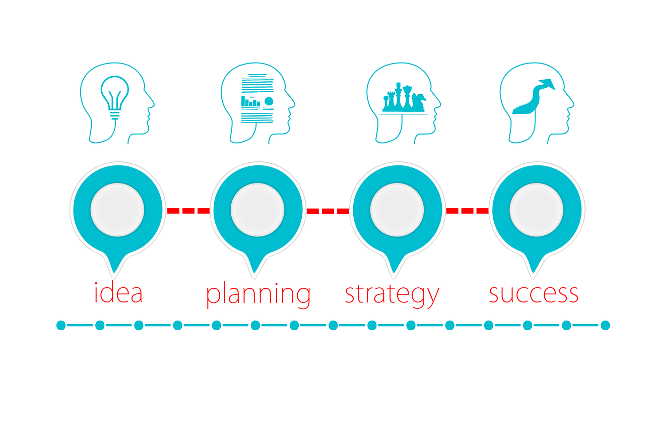
Ready to take your business to the next level? Let’s talk about something game-changing – having a brand identity guideline. It might sound a bit formal, but trust me, it’s like having a secret sauce that makes your business stand out and shine. So, why is having a brand identity guideline so darn good? Let me break it down for you:
1. Consistency is King:
Ever seen a dance routine where the steps kept changing? Chaotic, right? Your brand needs that same consistency. A brand identity guideline ensures that your logo, colors, fonts, and overall vibe remain constant across all platforms. This builds trust and makes your business instantly recognizable, whether it’s on your website, social media, or marketing materials.
2. Memorable First Impressions:
Your logo is like the friendly handshake that introduces your business. With a brand identity guideline, you ensure that your logo is not just a one-hit wonder but a memorable face of your brand. Consistent use of your logo creates a lasting impression on your customers – it’s like leaving them with a catchy tune they can’t forget.
3. Builds Credibility:
Just like you wouldn’t trust a dance instructor with two left feet, customers want to trust a business that looks polished and professional. A brand identity guideline gives your business a polished appearance, signaling to customers that you mean business. It’s the key to establishing credibility in a crowded market.
4. Easy Decision-Making:
Imagine getting ready for a night out and having to decide on your outfit, hairstyle, and makeup every time. Exhausting, right? A brand identity guideline streamlines the decision-making process for your business. It provides a set of rules and visual elements, making it easier for you to create cohesive and effective marketing materials without pulling your hair out.
5. Connects with Your Audience:
Just like you connect with friends through shared interests, your brand connects with customers through its identity. A consistent and well-defined brand identity creates an emotional connection with your audience. It’s not just about selling a product or service; it’s about building relationships.
6. Stands Out in the Crowd:
In a world full of noise, standing out is crucial. A unique and well-thought-out brand identity sets you apart from the competition. It’s like having a dance move that no one else can pull off – people notice, and they remember.
7. Facilitates Growth:
Want to take your business to new heights? A brand identity guideline provides a strong foundation for growth. As you expand your offerings or reach new markets, a consistent brand identity ensures that your business remains recognizable and resonates with a broader audience.
So there you have it, my savvy business buddies! Having a brand identity guideline is like having the ultimate playbook for your business success. It’s not about being rigid; it’s about creating a strong foundation that allows your business to flex, grow, and dance its way to success. Ready to make your brand shine? Let’s do this!
Contact us for help on creating your own unique brand identity!
FAQS
Choosing the right number of colors for your brand identity is a bit like deciding how many veggies to plant in your garden – it depends on what feels right for you. However, let’s aim for a balance that’s visually appealing and cohesive.
In general, it’s a good idea to stick to a primary color palette with around 2 to 4 main colors. These colors will be the stars of your brand, the ones that define its personality. Think of them as the core elements that you’ll consistently use across various materials – website, marketing materials, social media, you name it.
Alongside your primary colors, you can also have a secondary palette with a couple more shades. These can be variations or complementary colors that add depth and flexibility to your design toolkit.
The key here is not to go overboard. Too many colors can be overwhelming and dilute the impact of your brand. On the flip side, too few might limit your creative expression. So, strike a balance that reflects your brand’s character while allowing for versatility.
Just like in your garden, where a variety of plants brings vibrancy, a well-chosen color palette can make your brand visually appealing and memorable. So, pick those colors that resonate with your brand’s vibe and get ready to make a splash!
Choosing the right fonts for your brand identity is a bit like selecting the perfect dance partners – you want harmony, not chaos. So, let’s talk about how many fonts you should invite to the party.
Typically, sticking to two or three fonts is a sweet spot. Here’s the breakdown:
Primary Font:
This is your main dancer, the star of the show. Choose a clean and readable font for your main text – like the lead in a dance routine, it sets the tone for your brand. It should be versatile and easy on the eyes, making it suitable for body text on your website, marketing materials, and more.
Secondary Font:
Think of this font as your backup dancer, complementing the primary font without stealing the spotlight. It can add a touch of personality, perhaps a bit more stylized, and is perfect for headings, subheadings, or any text that needs to stand out.
Accent Font (Optional):
If your brand is feeling a bit fancy, you can bring in an accent font for special occasions. Use it sparingly – like a dance move that’s saved for the perfect moment. It could be a script font or something more decorative, adding flair without overshadowing the main act.
Remember, the key is consistency. Stick to your chosen fonts across all platforms – website, social media, marketing materials. Consistency in font usage is like having a synchronized dance routine – it looks polished and professional.
So, when it comes to fonts, keep it simple, keep it coordinated, and let your brand waltz its way into the hearts of your audience!
A brand identity guideline is like the roadmap that keeps your brand on track, ensuring that every visual element aligns with your business’s personality and values. So, what’s typically found in this design bible? Let’s break it down:
1. Logo Usage:
Your logo is the face of your brand, and the guideline will detail how it should be used. This includes variations, clear space around the logo, and guidelines for different backgrounds.
2. Color Palette:
Like a painter’s palette, this section outlines the approved colors for your brand. It includes primary and secondary colors, along with their Pantone, RGB, CMYK, or hex values for consistency across various mediums.
3. Typography:
Fonts play a crucial role in your brand’s voice. The guideline specifies the primary and secondary fonts, including styles and sizes for headings, subheadings, and body text. It ensures a cohesive and readable look across all communication.
4. Imagery Style:
Just as your garden has a particular aesthetic, your brand imagery should follow suit. This section outlines the style of images and graphics that align with your brand. It might include guidelines on photography style, illustration preferences, or any visual elements unique to your brand.
5. Voice and Tone:
Your brand’s personality shines through its voice. This section defines the preferred tone for communication. Whether it’s friendly and casual or formal and informative, the guideline ensures a consistent brand voice across all written content.
6. Iconography:
Icons can be powerful visual elements. The guideline might include specific icons or symbols that are part of your brand’s identity, along with guidelines on their usage and styling.
7. Stationery and Collateral:
For small business owners, this is where you’ll find details about business cards, letterheads, and other printed materials. It includes design templates, layout guidelines, and specifications for maintaining a cohesive look.
8. Digital Presence:
In the age of websites and social media, the guideline will often extend to digital platforms. It might include specifications for your website’s design elements, social media posts, email templates, and more.
9. Usage Do’s and Don’ts:
To prevent any missteps, the guideline provides a clear list of do’s and don’ts. It covers situations like resizing logos, altering colors, or using fonts outside the specified range.
10. Brand Story and Positioning:
This section might delve the broader context of your brand – its story, mission, and positioning in the market. It helps to keep everyone on the same page regarding the brand’s essence and purpose.
Having a well-documented brand identity guideline is like having a trusted partner in your design journey. It ensures that whether you’re creating a website, designing marketing materials, your brand remains true to itself.
#234794
#152a58
#070e1e
#e9ecf4
#972b16
#54180c
#210904
#ede7e6
#bd8f2c
#947023
#564114
#e9e2d2
#234794
#152a58
#070e1e
#e9ecf4
#972b16
#54180c
#210904
#ede7e6
#bd8f2c
#947023
#564114
#e9e2d2

Logo Fonts
Made to be = Desire Pro
Unique = Chin up Buttercup
Website & Branding Fonts
Headings = Open Sans
Special = Antic Slab
Body = Open Sans